Career Compass
Empowering students in their professional journey, supporting young professionals exploring new careers.
- Timeline
- October – November 2023
- Role
- UX Designer & Researcher
- Team
- Adit Patel, Vanessa Ho, Arianne Poblete
- Tools
- Figma, SurveyMonkey
Overview
A job search companion for students and young professionals.
CareerCompass is a mobile app that helps students and young professionals find and apply for jobs, supporting them through the whole search: networking, interviewing and building a resume.
It was my first design challenge, built over October and November 2023 with a team of three. I worked as a UX designer (digital wireframes, low- and high-fidelity prototypes) and UX researcher (user interviews, competitive analysis and usability tests).
The problem
Standing out in a space full of established job apps.
Our priority was empowering students in their professional journey. That meant designing for several kinds of users with different needs.
With industry-leading job search apps already out there, the real question was which problems they leave unsolved, or don't solve well.
The solution
Everything a job search needs, in one place.
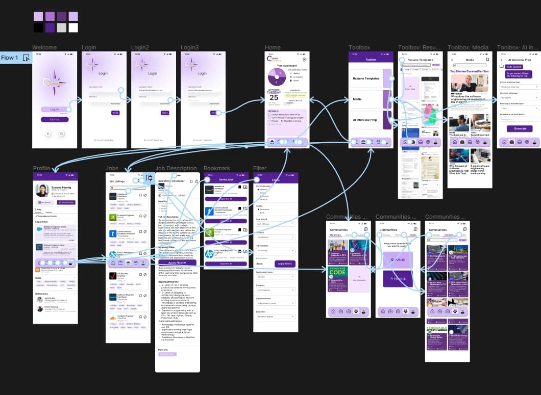
CareerCompass brings the tools job seekers juggle into one app, to take some of the workload and stress out of applying.
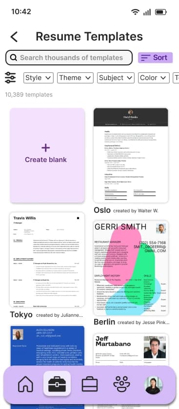
- Resume builder
- Build your resume right inside the app.
- AI interview prep
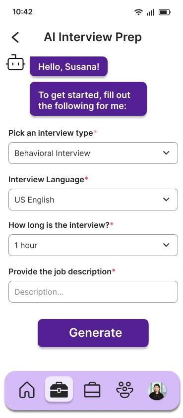
- Practice with prompts tailored to the role and interview type.
- Calendar
- Balance applications and interviews with everything else on your plate.
- Communities
- Network through groups in your field.
- Media
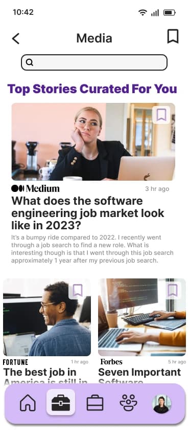
- Trending news in your industry, to keep your skills current.
Competitive analysis
Finding the gaps the big apps leave behind.
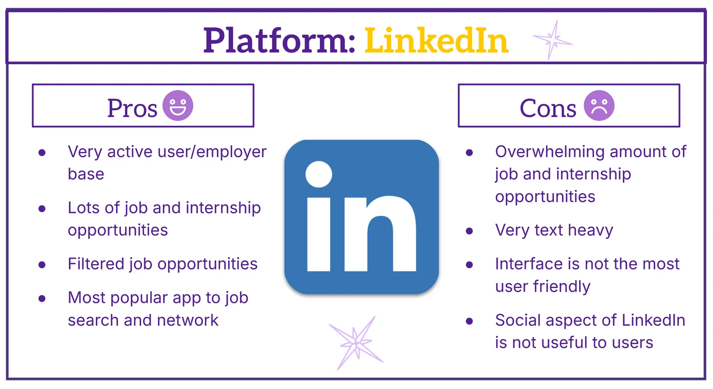
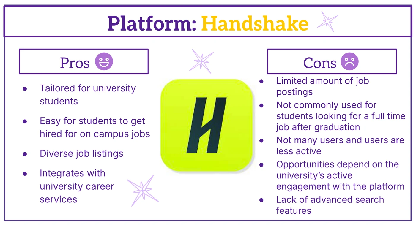
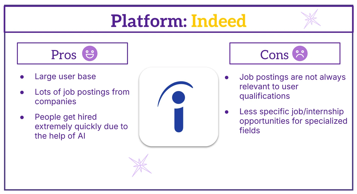
Research started with the job search apps already on the market. For each one we compared branding, design, strengths and weaknesses, to understand which features were essential and where a new app could stand out.
User research
Listening to students at every stage of their search.
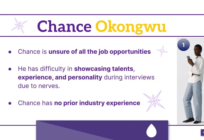
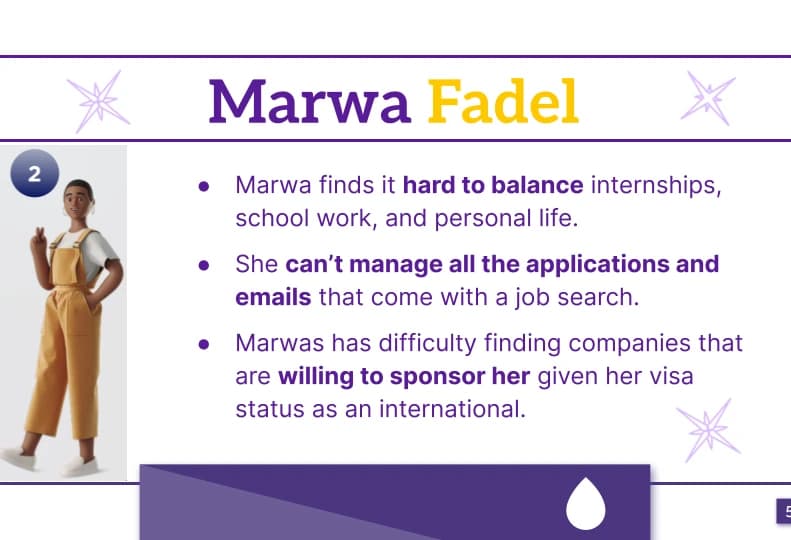
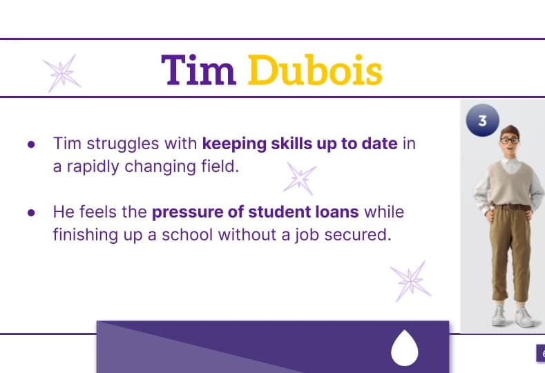
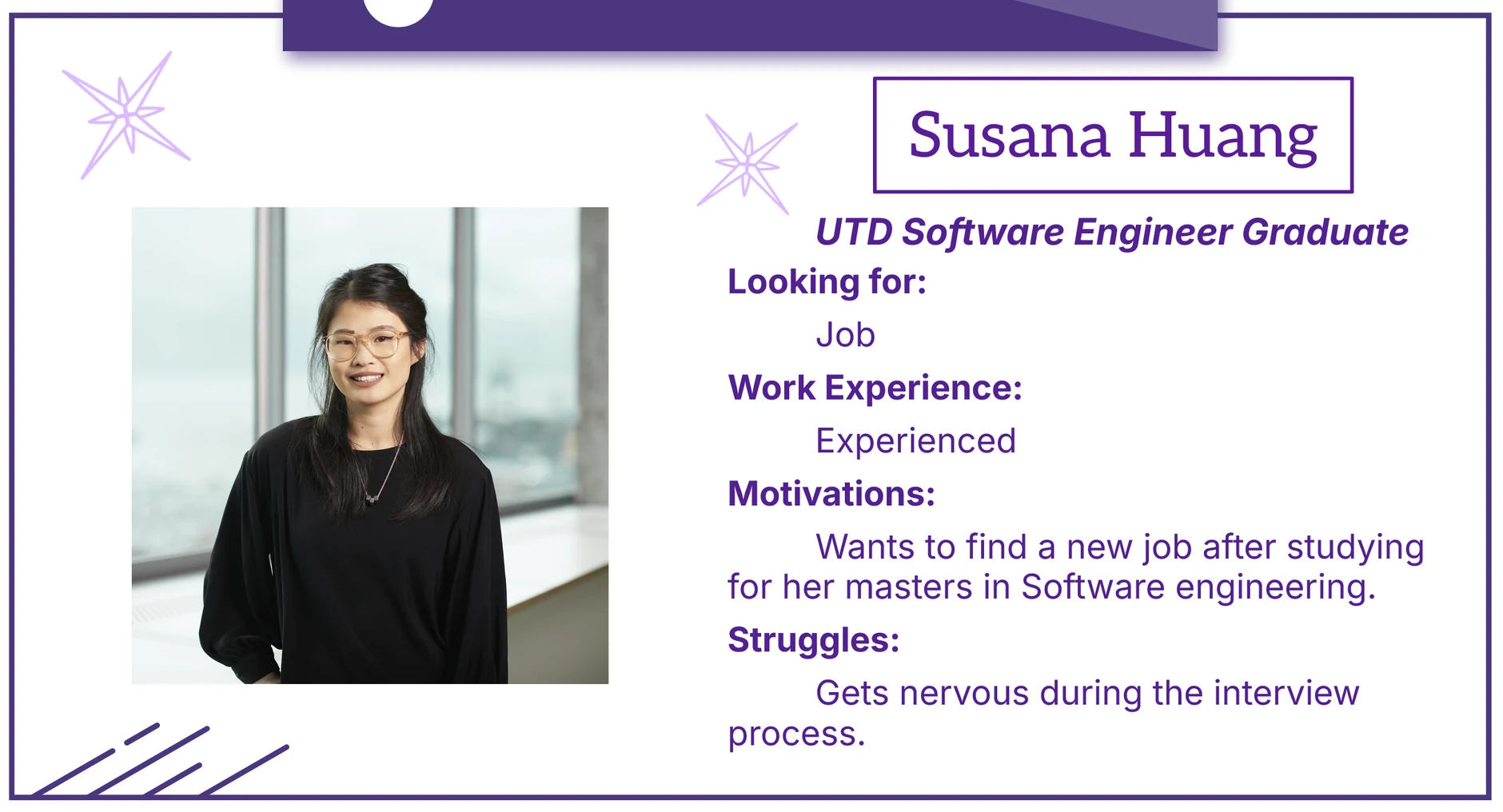
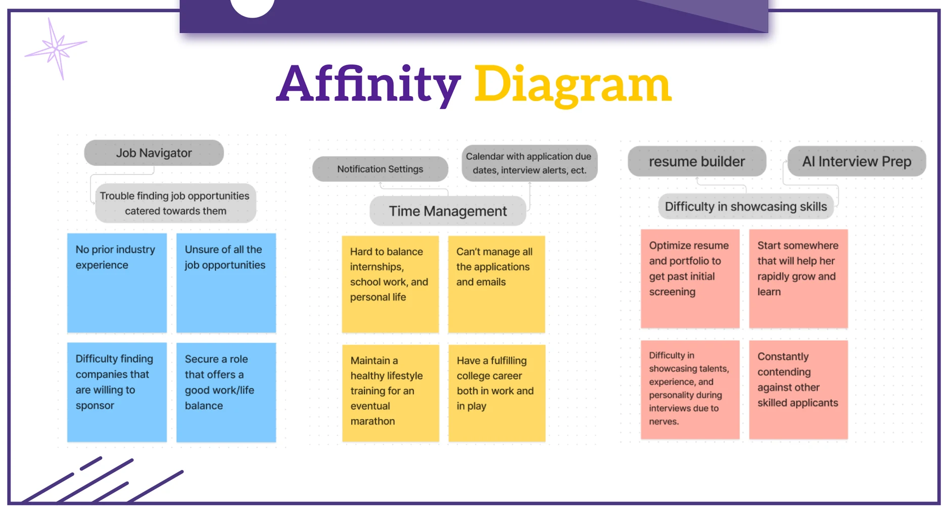
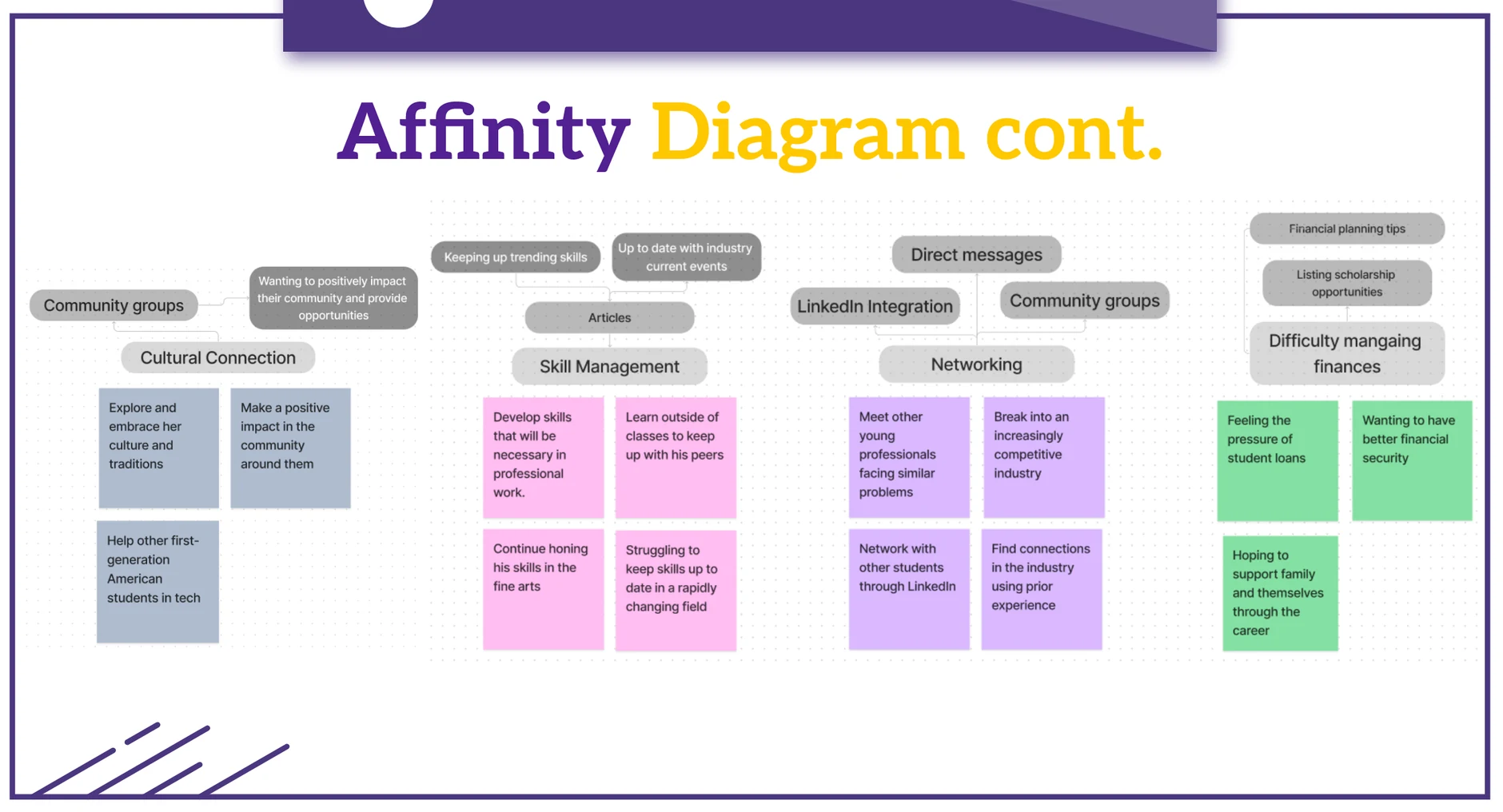
Next, we interviewed at least three students across undergraduate, graduate and post-graduate levels to uncover their pain points and needs.
Combined with the three personas we were given at the start, those findings shaped our own persona, a user journey and an affinity diagram.
Wireframing
Sketching for easy navigation first.
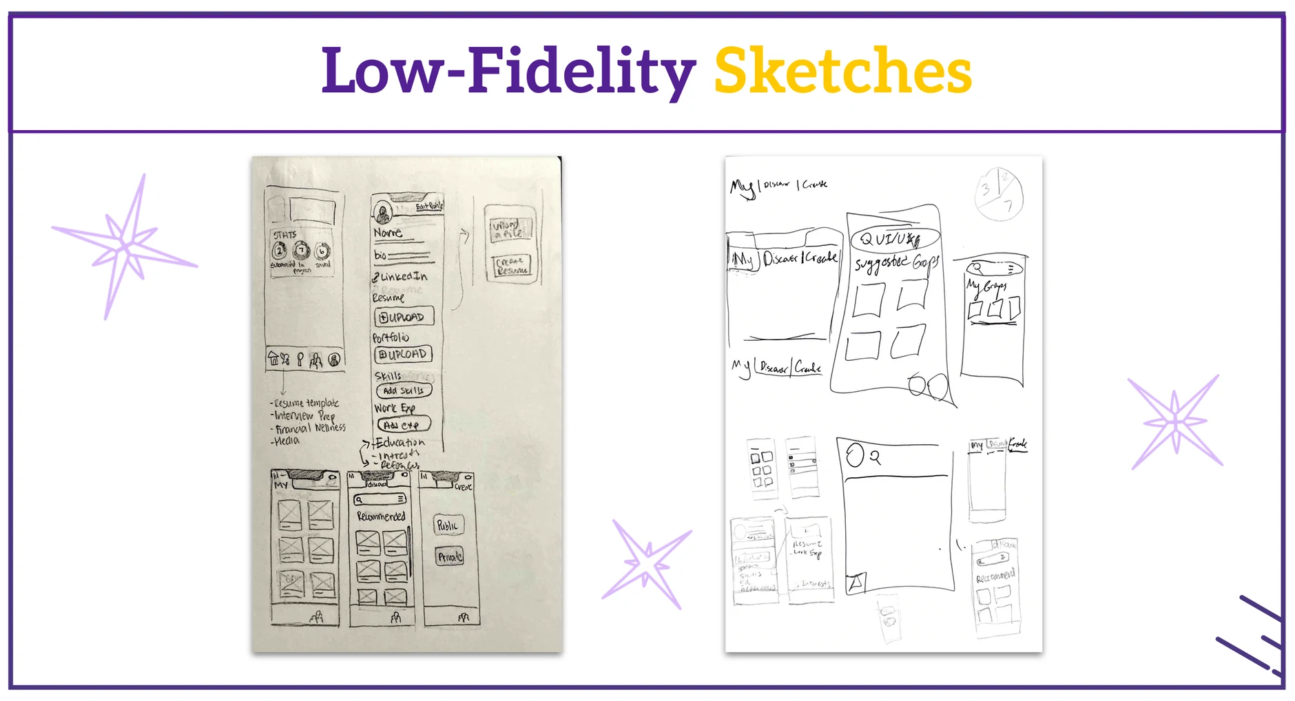
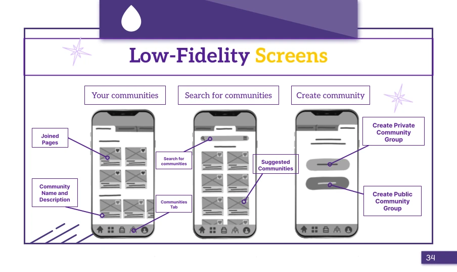
With the core features defined, we sketched low-fidelity wireframes of the key screens, focused on how easily users could move around the app and get to what they needed.
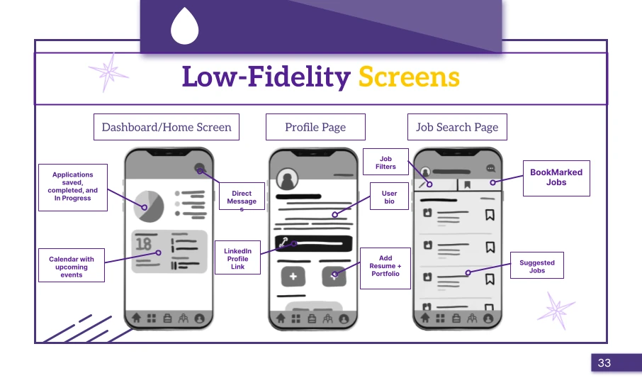
We then turned the sketches into digital wireframes, adding the screens we hadn't sketched at first.
Usability testing
Navigation wasn't as simple as we thought.
Once the prototype worked end to end, we ran a usability study focused on how easily people moved through the app and how quickly they found what they were looking for.
Getting around turned out to be harder than intended, so navigation went through at least two more iterations.
High-fidelity prototype
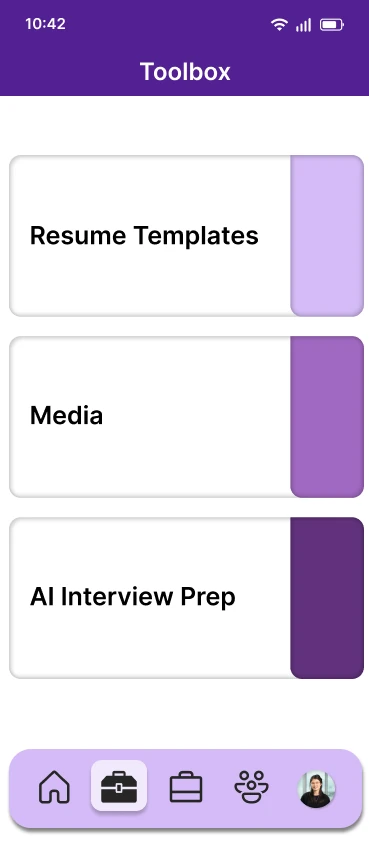
Polishing the experience and adding AI interview prep.
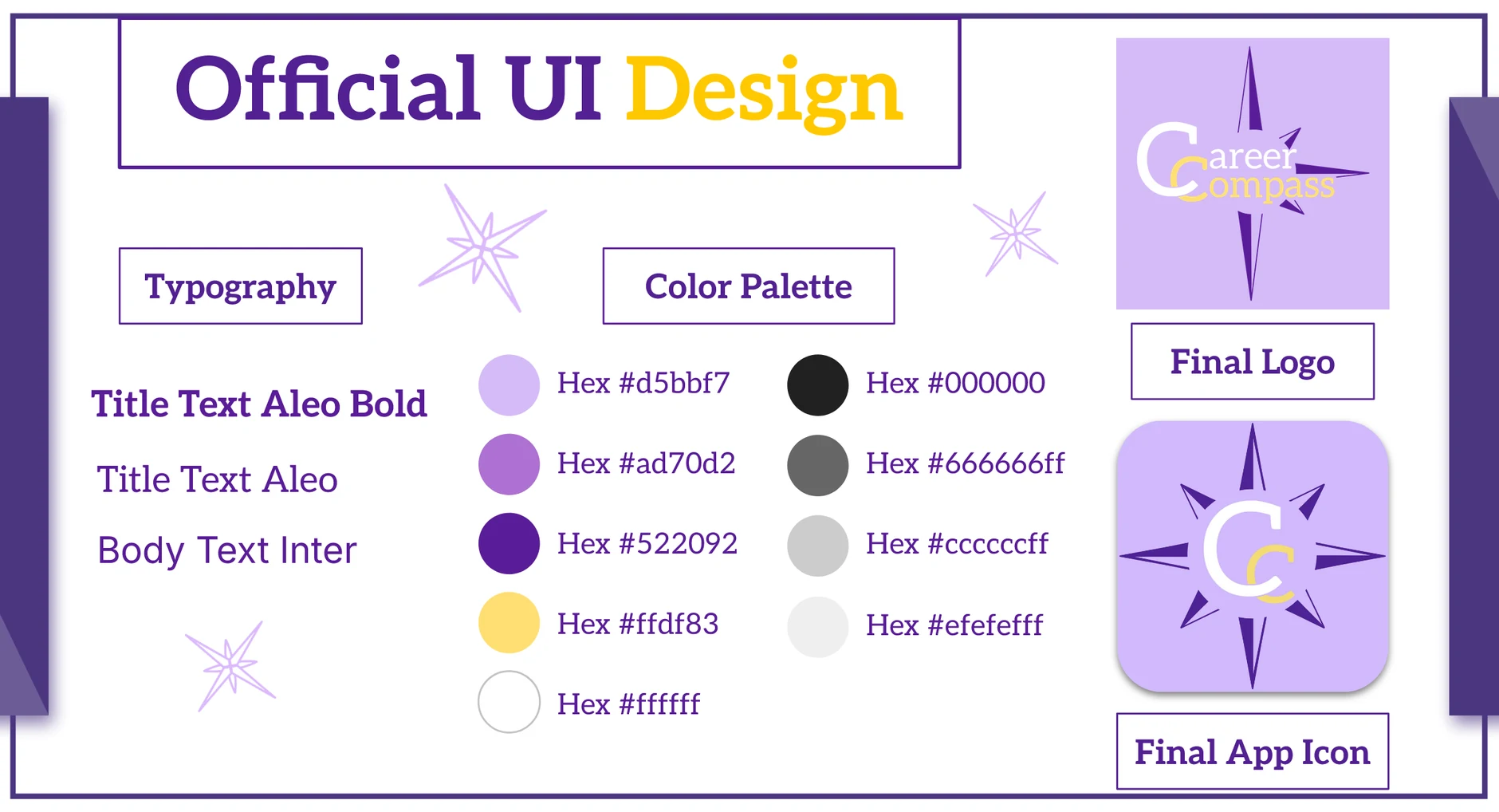
High-fidelity screens began as the final low-fidelity round wrapped up. We referenced competitors' layouts, then gave the UI distinctive foreground and background elements to keep it simple and inviting.
User feedback led us to rework the home screen and add a new AI interview prep screen. We closed the challenge by presenting the concept and our process to judges from Intuit and an audience, then reflected on their feedback for future work.
Reflection
My first design challenge, and a crash course in the whole process.
Working with a team of three outside the classroom was new for me. I came away with a much deeper grasp of the research that comes before sketching: affinity mapping, user interviews and competitive analysis.
Taking the work from rough sketches to high-fidelity screens over several iterations gave me a real appreciation for how much each stage of design asks of you.
Prototype
Try the final design yourself.