Etched Quality Care
An AI-driven healthcare app providing accessible info for health queries.
- Timeline
- January – May 2024
- Role
- Lead Designer · UX design & research
- Team
- 1 designer, 6 engineers (UTDesign)
- Tools
- Figma
Overview
Making everyday health answers easy to reach, especially for older adults.
Etched Quality Care is an existing personal care service, helping clients with mobility, housekeeping, bathing and dressing, medication reminders and exercise.
Through a UTDesign project sponsored by Etched, I joined as the sole designer alongside six frontend and backend engineers to design an app (with a website to follow) that gives timely advice and makes it simple to keep an eye on everyday vitals.
I owned the design end to end, from digital wireframes through low- and high-fidelity prototypes, and ran the usability tests.
The problem
Catching health issues early, without trying to replace the doctor.
The priority was a product that could flag potential health abnormalities before they grow, and offer non-pharmaceutical, lifestyle-based advice that lowers the chance of problems and can ease symptoms.
Just as important was what it shouldn't be: a replacement for medicine or clinical care when something serious is going on.
The solution
One app, three portals: physicians, caregivers and patients.
We proposed an app and website split into portals, each built around what that person needs most.
- Physicians
- Diagnostic tools and data analytics that generate AI advice on environmental factors like sun exposure, hydration and sleep.
- Caregivers
- Personalized care plans and real-time monitoring to support their loved ones.
- Patients
- Instant answers to everyday questions, without the trip or the cost of a doctor's visit for something easily solved.
Sketching the flow
Starting on paper, with ease of access first.
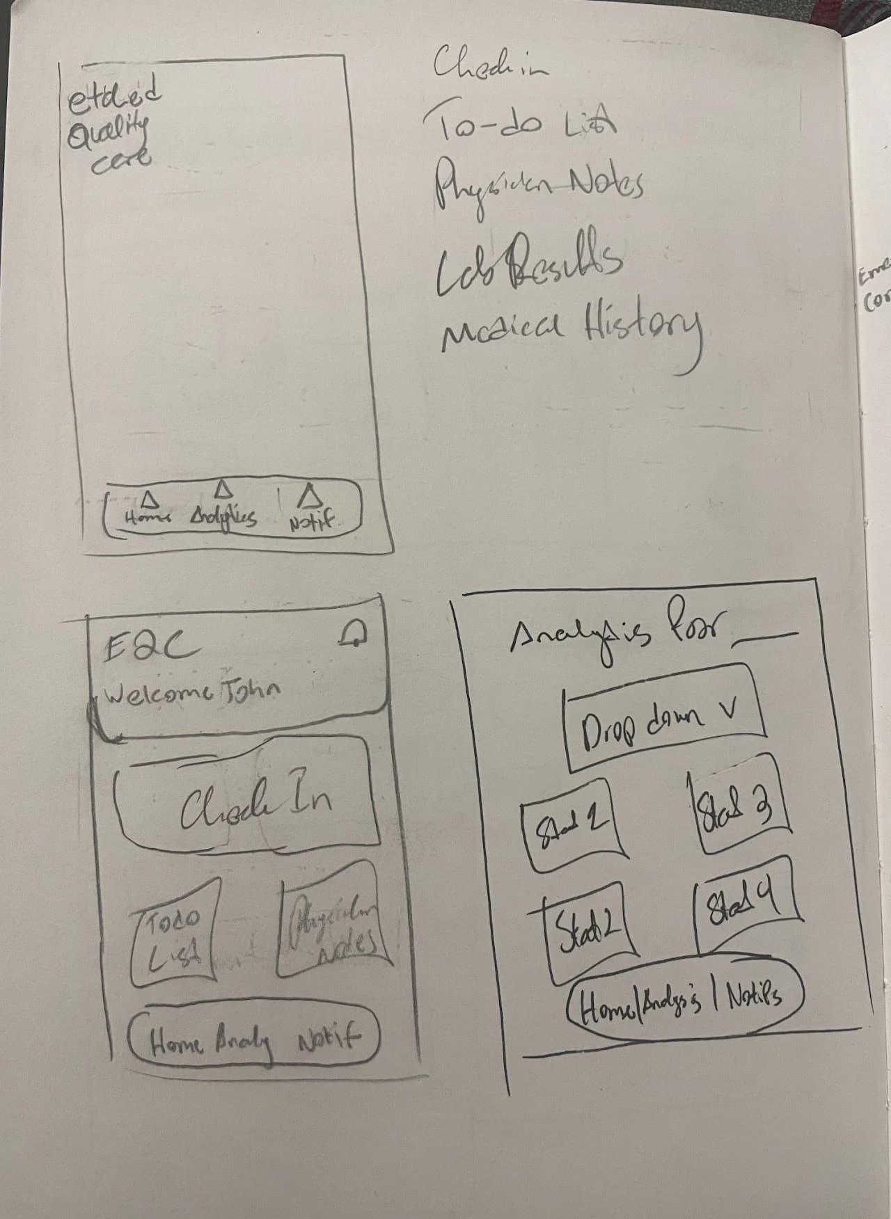
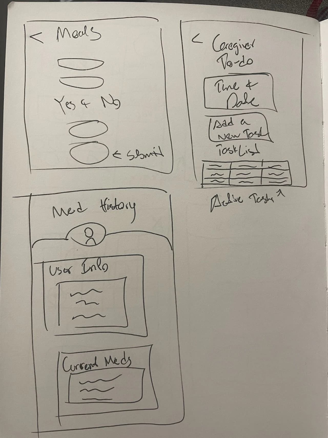
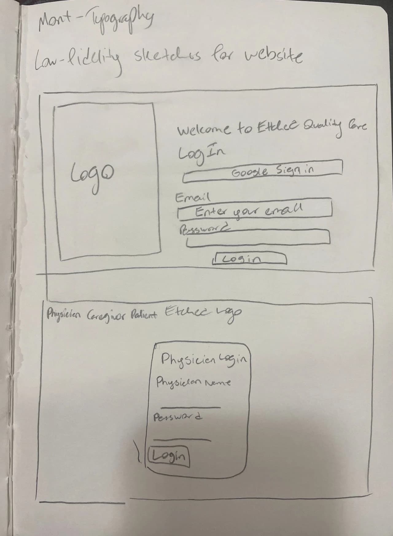
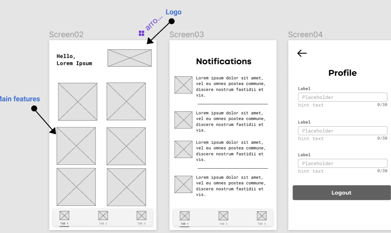
After a few rounds with the iOS and web teams, we had a shared picture of the core features. From there I sketched low-fidelity wireframes of the key screens in the user flow.
Every decision came back to two questions: is this easy for our users to get around, and how quickly can a patient find what they need?
Low-fidelity wireframes
Filling in the screens we hadn't thought of yet.
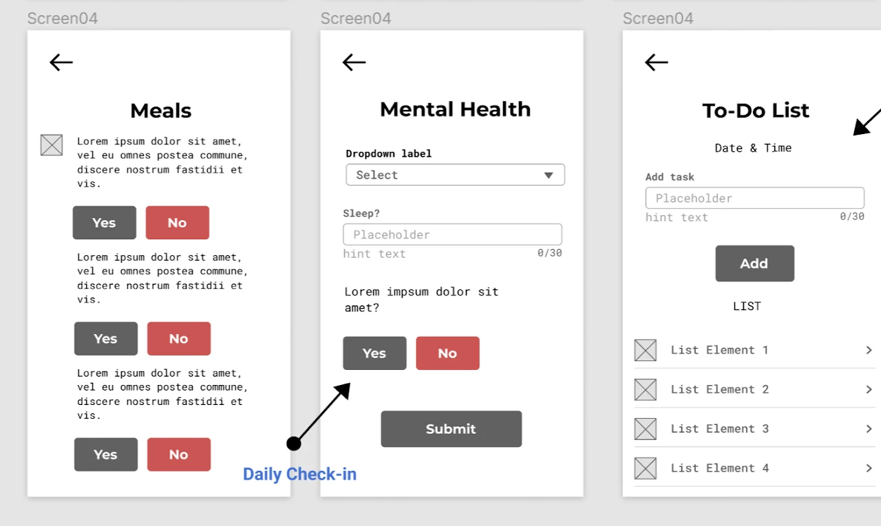
I turned the sketches into digital wireframes, and along the way added the screens the team hadn't initially mapped out but the flow clearly needed.
High-fidelity prototype
A calm, simple interface, refined through feedback.
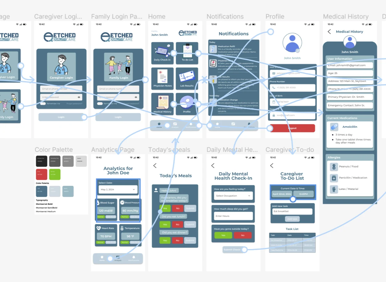
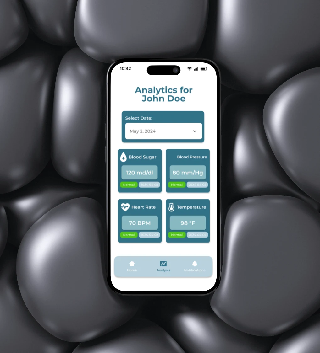
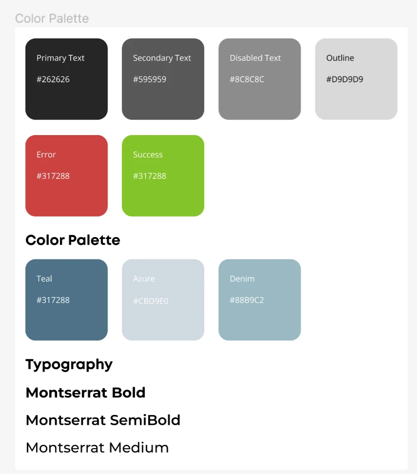
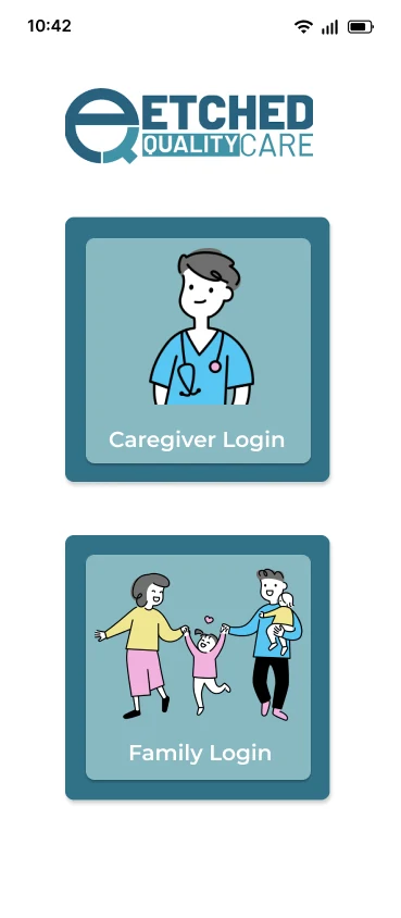
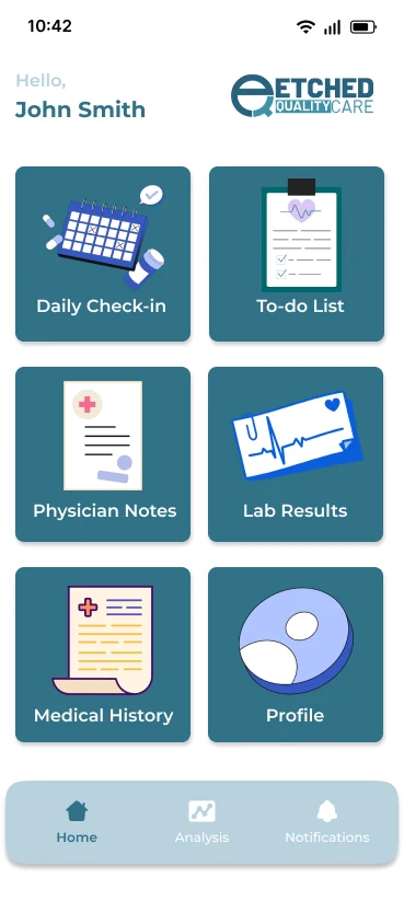
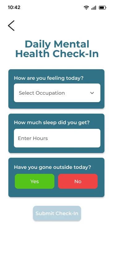
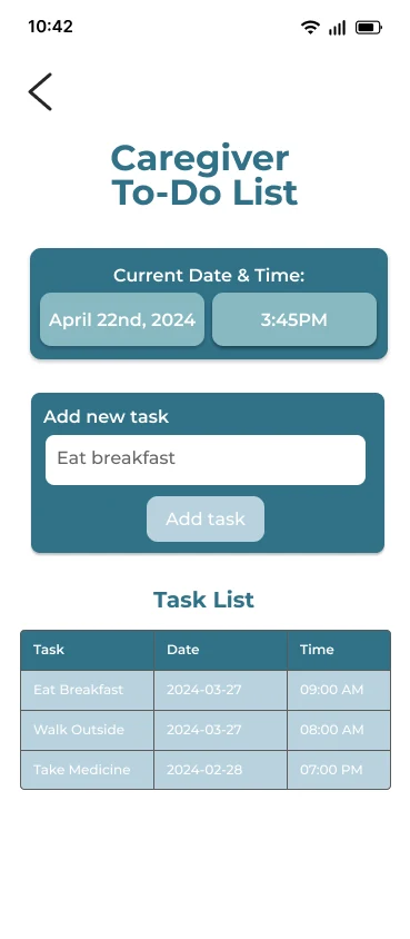
High-fidelity work began as the last low-fidelity round wrapped up. I looked at how competitors laid out their screens, then gave ours distinctive foreground and background elements to keep it simple but memorable.
Team feedback shaped several rounds of changes, most visibly to the home and profile screens. We closed the semester presenting the work to UT Dallas faculty and industry professionals, and folded their questions and feedback into plans for future development.
Testing
Testing with the people around us, with more planned for launch.
Once the prototype was functional, I ran usability tests with teammates and peers.
We also planned surveys with the sponsor, their team and the target clients they'd lined up, to gather metrics and feedback that would drive bug fixes, UI changes and possibly new features. The project didn't reach deployment within the semester, so that round is still to come.
Reflection
Designing alongside six engineers taught me to make design legible.
This was my first taste of real-world product work. Collaborating with six programmers without a design background was challenging at first, especially trading ideas that could actually make it into the app and website.
Staying in constant contact with our sponsor at Etched, including on legal requirements, added another layer. With a team new to a project of this size, we built habits to stay aligned and use our time well.
We hope to take the product to market with Etched someday, and a companion website with the same features and design is in ongoing development.
Prototype
Try the final design yourself.